With 24/7 internet access on smartphones and tablets, folks these days are drowning in information. As screens and attention spans shrink, so too must our content. In the past couple years, blog posts have given way to Facebook updates, Tumblrs, and tweets. And the meteoric rise of Instagram and Pinterest shows that people are weary of words and hungry for eye candy.
Turns out, there is a scientific explanation for our love of visuals. Our brains treat text as a series of symbols, meaning we have to decode words to grasp their meaning. Pictures, on the other hand, speak for themselves. There is an art and science to choosing photos (we’re compiling a report that merges the latest research and expert advice on imagery for advocacy, and you can be the first to receive it by signing up here). But for this article, we’ll focus on visual communications’ latest craze: infographics.
They are everywhere. I can’t open Facebook without being confronted by visualizations of everything from the fiscal cliff to the zombie apocalypse. But, infographics only work if the basic ingredients are good (you know that old saying about lipstick on a pig…). If you don’t have something new and interesting to say, great design can’t save you.
Since I’m a communicator not a designer, I’ll focus on the content side of the equation. If you’re hungry for Pantone talk, come to NTEN’s Nonprofit Technology Conference and join my Draw Me a Story workshop, where I’ll team up with infodesigner extraordinaire David Schellinger to dish on everything from color to composition to distribution.
Any marketer worth their salt can tell you a powerful infographic is social media solid gold. But what is it that compels people to share, like, or tweet? Or to write a check or take action? It’s not a beauty contest. Your graphics have to mean something, and the data they convey has to matter.
To get at this meaning and mattering stuff, I like to start with the four W’s (actually, number four starts with an H, but you get the idea…):
- Who are you trying to reach?
- What do you want them to know (and do)?
- Why should they care?
- How will you get in front of them?
Number one helps you get at audience. “The general public” is not specific enough. Do you need to illuminate an issue for policymakers? Reassure your donors that their dollars are being put to good use? Convince green lifestylers to waste less food? Once you’ve identified the target, you can begin developing a concept that will resonate with their values.
Next, you need to articulate the take-away. We’ve all seen graphics that contain a bunch of numbers and figures without a coherent narrative. So before you whip out the colored pencils, take a moment to draft a paragraph that tells the story of your information. This text won’t end up in the final product; it just informs the design. Check for clarity by brainstorming headlines or tweets that might accompany the infographic. Is the moral of the story simple enough to convey in 140 characters?
The “why” (or “so what”) question is key. It’s an opportunity to check the timeliness and relevance of your concept. Can you tie it to current events? Does it impact people’s homes, health, or happiness?
Finally, it’s never too early to think about delivery, because this too will influence design. If you are hoping to blast your infographic out across the interwebs, make sure it works on the small screens of today. That means no epic scrolling required. And for digital distribution, you should be able to sum up its significance in a tweet, Facebook post, or email subject line.
Once you’ve answered the four W’s, it’s time to get visual. Here again, I find a formula helpful to make sure the story you’ve composed with words comes to life graphically. The elements I like to think about are:
Setting: Many of my favorite infographics are cast against a familiar backdrop—a family home, specific country, or even a season. This immediately orients the viewer and helps connect the information to their lives.
Consider this Sightline graphic about a proposal to ship 48 million tons of coal through Seattle each year. It uses local landmarks to show the sheer scale of the proposal, and drive home the idea that this mountain of coal will be going through Seattleites’ backyards.
Problem or opportunity: Business as usual doesn’t make for a very exciting story. Effective infographics illustrate the need or chance for meaningful change.
Another great Seattle example: this graphic from a campaign to clean up Puget Sound created a Tox-ick monster to show that polluted run-off from yards and streets adds up to a big problem in the Sound. It tees up the campaign’s call to “stop feeding the monster.” Which brings us to our next key component.
Solution or call to action: Don’t be a Debbie Downer. If you are going to shine a light on a problem, by all means offer a solution.
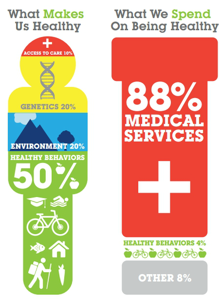
You don’t have to hit people over the head with it. Consider this graphic about the disparity between the factors that influence our health and our wellness spending habits. It doesn’t explicitly urge the viewer to exercise or eat more fish, but it highlights the benefits—cost savings on doctor’s visits and medication—that people can realize if they invest in a healthy lifestyle.
Ready to draw your own story? Walking through the four W’s before you hire a designer, and having a setting and plot for your story should set you up for success. If you are looking to DIY, TechSoup has compiled a great list of free resources.
Have examples of powerful nonprofit infographics that tell a story visually? Please post the links in the comments section below. I’ll add them to our Pinterest board that helps to shine a light on worthy causes and good design.
Originally posted on NTEN.org