At first glance, a map appears an objective way to display information. Maps may or may not be accurate or true to scale, but they don’t take sides.
Think again. Here is an example where – by exploiting the psychology of color – maps can become propaganda.
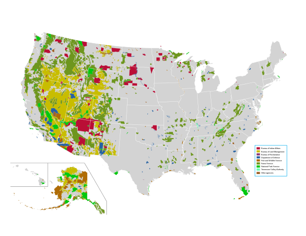
Below are two renditions of the same base data: Acreage of land managed by the federal government in the United States. In the map produced by the US Geological Survey, the acres are cast in a variety of colors, particularly earth tones. Dark green for national forests, tan for Bureau of Land Management, and the like. Adding to the patchwork are Native American reservations, military bases and national wildlife refuges.
Compare that to a map compared by American Lands Council, a libertarian group aimed at getting rid of national forests and other public lands owned by all Americans and managed by the federal government.
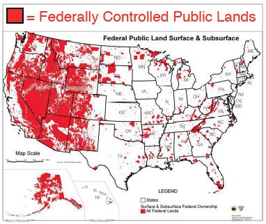
In the ALC’s map, all the land is lumped together and it’s all bright red. Trust us, that is no coincidence.
First off, coloring all that land the same color gives a distorted oversimplification of what is happening on the ground. Yellowstone National Park, 29 Palms Marine Corps Base, and the Pine Ridge Indian Reservation all have very different missions and purposes. But they are all lumped under that handy ALC bogeyman, the federal government.
Another trick is the use of the color red. Psychologists tell us that red triggers our minds by evoking certain emotions. For a very long time and across cultures, red is associated with war, conflict and danger (along with dangerous passions, say Valentines). As the University of Florida’s Stephanie Rosenblatt puts it, “Red is the color that triggers the fight-or-flight intuition in animals, due to its association with blood.”
Using red on this map not only displays acreage – it pushes emotional buttons.
To be fair, other colors have emotional connections as well. The federal agency map of public land uses light green to represent national forests. Rosenblatt says: “Green reflects nature’s serenity. Green ties us back to our roots, giving us a feeling of retreat from the materialistic, bustling life.”
In short, images are powerful because they evoke emotions. The color palate is one way humans relate emotions, just as our choice of words are. This is important to keep in mind, whether you are trying to send a message or you are the recipient of one.
— Ben Long