Download your own copy of this tipsheet here.
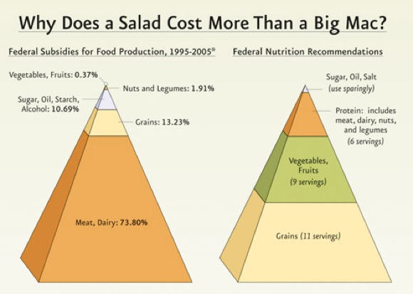 The graphic to the right is not much to look at. But it made the New York Times in 2010, and continues to make the rounds in the blogosphere years later.
Why? Because it puts a (still) timely agricultural policy problem in perspective using the familiar food pyramid, connecting crop subsidies with consumers’ plates and pocketbooks.
With tools like easel.ly, infogr.am, and piktochart.com, any communicator can illustrate their data. But slick design doesn’t generate media coverage or social shares.
Content is still king. And good content requires a bit of work, so we offer a five-step process to get yours in shape.
STEP 1: GET CLEAR ON GOALS
Simple infographics are the ones that sing, and streamlining requires a laser focus on target audience, channels, message, and desired outcomes. Start by answering these four key questions:
- Who are you trying to reach?
- What do you want them to know (and do)?
- Why should they care?
- How will you get in front of them?
STEP 2: WRITE YOUR STORY
Write before drawing. Look again at your data with audiences and outcomes firmly in mind, and begin to weave the facts and figures into a story. Consider this organizational framework:
Setting or Value + Problem or Opportunity + Solution or Call to Action
Jot down a paragraph that puts your data into context with people’s lives, and explains its significance. Now distill that into a headline, email subject line, or tweet.
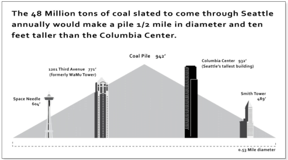
The example below is simple, but powerful. It drives home the scale of a coal export proposal, showing the volume of coal that would be shipped through Seattleites’ backyards against the backdrop of iconic landmarks.
STEP 3: PUT IT IN PICTURES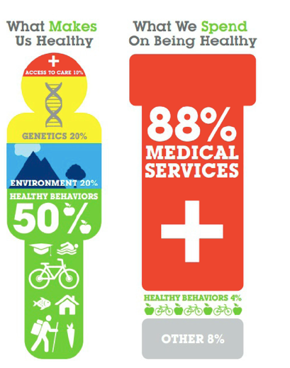
The human brain is wired to process images more efficiently than text. And, with the average online attention span hovering around eight seconds, a picture (or shape, or symbol) really is worth a thousand words.
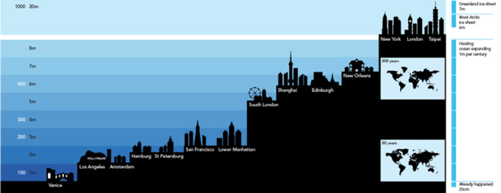
Consider the graphic at right on health and wellness. The contrast between human form and pill bottle says it all. In the sea level rise graphic below, the words and numbers are almost unnecessary. In fact, The Guardian ran a version without any copy.
Choose visuals that do the following:
- Evoke shared values, norms, or familiar places
- Illustrate scale, sequence, or time
- Contrast two possible outcomes
STEP 4: LAY IT OUT
Size matters. The average smartphone screen is 3.5 inches, and computer screens are wider than they are tall. Design your graphic accordingly.
STEP 5: SERVE IT UP
Make sharing easy. Create a microsite that includes a few words of introduction along with sample tweets, social media share buttons, a link to download the image file, and HTML code for embedding in blogs or websites.
REMEMBER
- Write before you draw
- Keep it simple
- Design for the small screen
- Make sharing easy
Download your own copy of this tipsheet here.