You know that restaurants put a lot of effort into making decisions, such as creating atmosphere and choosing what dishes to serve, but did you know that includes choosing fonts for menus and more? Researchers have found that font choices impact whether customers will stop to read a message, and how long they will stay to read it. According to The Next Web, font choice, spacing between words, and length of sentence line can all affect the way we feel. Article author Mikael Cho breaks it down by looking into the science of how we read.
When we read, a natural pattern takes place called a “scan path.” This scan pattern refers to the reading and pausing process that naturally takes place when we read. Our brain typically reads about 7-9 letters, then pauses. During the reading stage, it is impossible for “visual processing” to occur, which is where we create images in our head. Instead, we experience visual processing when we pause, because that’s when we absorb information.
So what does this have to do with our emotions? It means that poorly-chosen fonts may have a negative impact on a reader’s emotions, while well-chosen fonts may do just the opposite, inspiring us and sometimes even leading us to take action.
There are strategies for choosing a good font. Here are three of our favorites:
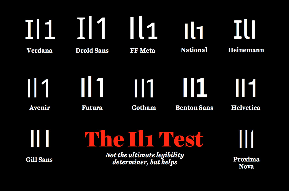
- See if your font passes the “Il1 test,” as illustrated by type designer Jessica Hische (below). This test refers to whether the uppercase I, the lowercase l, and the number 1 all look different within a font. The idea behind the test is to make sure readers don’t have to think twice about what letter (or number) is there.
- Manage line length. A good line length contains about 50-75 characters. Proper line lengths aid the scan pattern process, while poor line lengths slow it down. For example, a line length that is too short leaves the reader having to constantly revert to the left side of the page, while one that is too long leaves the reader susceptible to skipping lines and losing track of their place in the reading.
- Look at the spacing of words. Simply put, proper spacing makes the reading process easier. That’s because it takes longer for the brain to process words that are closer together that those that are farther apart.
So, go ahead and make your readers feel good. As this landmark MIT study showed, “good typography induces a good mood.” Have you tested fonts with your readers? We’d love to hear about your results!
–Rachel Dobson, Fall Intern