Just how big is the Great Barrier Reef? A quick Google search will tell you that it is approximately 2300 kilometers long and covers 344,400 square kilometers. That’s pretty big. But, just how big?
It is difficult for people to wrap their head around large and obscure numbers. Grounding numbers in a comparison to a well-known object makes it easier to comprehend. Using a visual to communicate this comparison can be the silver bullet to effective communication.
Take a look at the visual below. Assuming that the audience is from the United States or Europe, the image on the left is not much more effective than the numbers alone. Pairing it with the two images on the right, however, places it into a familiar context by overlaying the Great Barrier Reef onto Europe and the western U.S.. If you have driven down the coast, you probably have a pretty good feel from the visual on the far right of just how long the reef really is. Putting it into this familiar context helps the audience better grasp what the authors are trying to communicate: just how big the Great Barrier Reef really is.
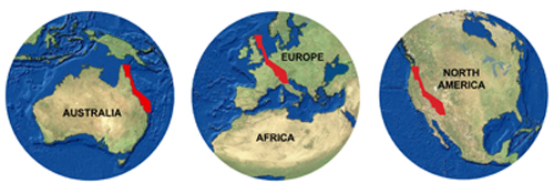
Source: gbrmpa.gov.au
For another example, check out the visual from NASA below. Noting that the International Space Station which spans approximately the area of a football field, they created this visual to succinctly communicate its size to a general audience without any need for numbers or measurements.
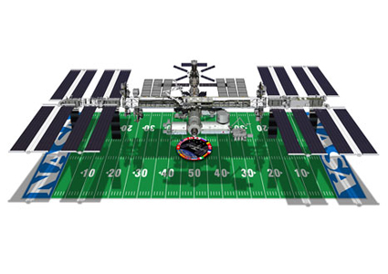
Source: NASA
Effectively communicating size and scale is not always the sole challenge. Sometime it can be difficult to convey the impact of such numbers. Luckily, visuals also offer a creative and effective way to communicate impact as well. Take the work of Mary Brandenburg, for example. Recognizing that most people can imagine what two or three feet of water looks like, but that many fail to understand the impact of such a slight rise, Brandenburg got creative. The portrait series, entitled “Sea Level Rise in My Lifetime”, shows young people standing in water equivalent to the predicted sea level rise by the time they reach their life expectancy. The girl on the left is standing in 26 inches of water, the amount that the sea is predicted to rise in Portland, Oregon, by the time she reaches her life expectancy in 2068. The boy is almost totally submerged in the 39 inches of water that the sea is expected to rise by 2076 in New Orleans.
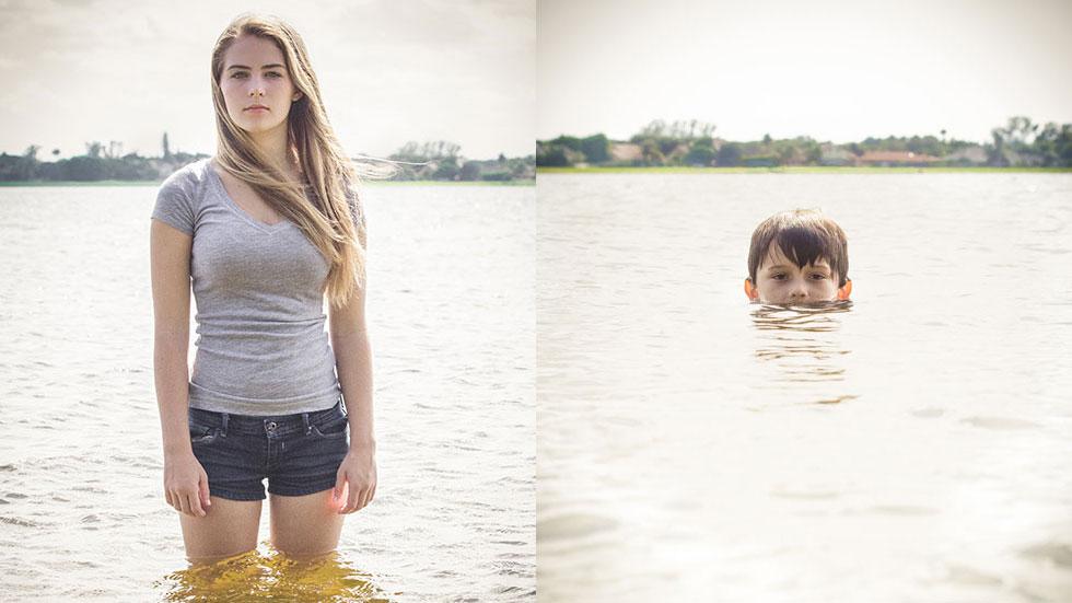
Photo Credit Mary Brandenburg, source: Weather.com
–Serena Bernthal-Jones, former Resource Media intern